Smith Farms
Designing a simple online purchase experience so a local egg farm could continue serving existing customers when in-person, cash-based sales were no longer practical.
View Prototype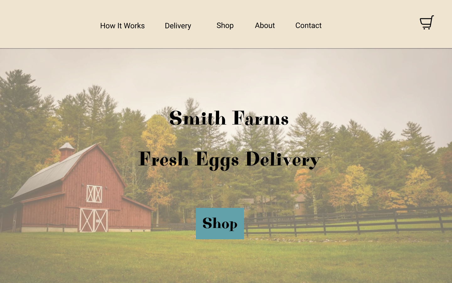
Move a trusted local relationship online without making the experience feel complicated.
Problem
Smith Farms had a loyal customer base that bought eggs directly from the farm and paid cash in person. When that model was no longer viable, the business had no way to accept online orders, collect payment, or coordinate local delivery.
Design direction
I designed a focused e-commerce flow that kept the product catalog simple, made delivery eligibility clear, and guided customers from product selection through checkout and order confirmation with as little friction as possible.
Understand
Talk with the owner, define business constraints, and identify what existing customers needed.
Map
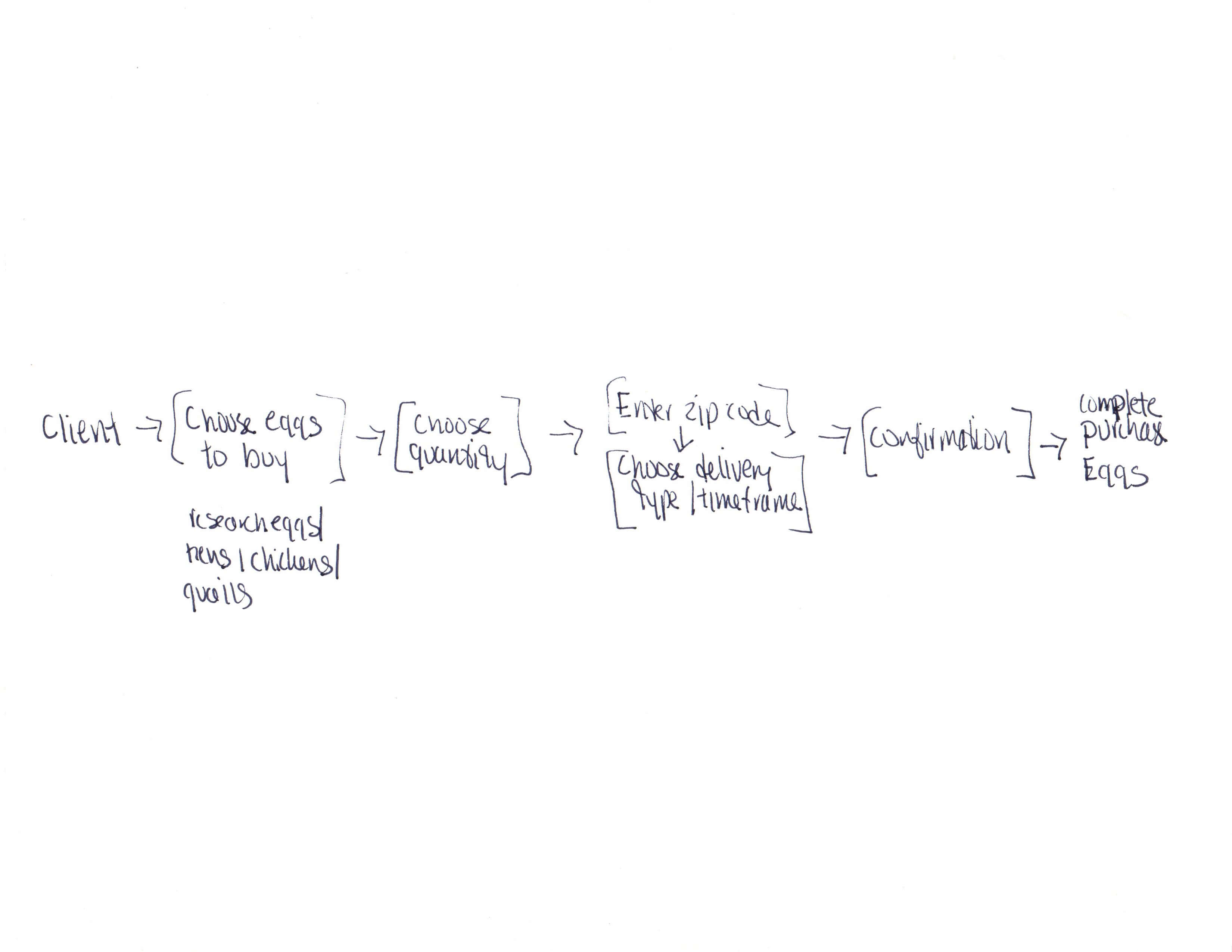
Map the purchase journey from discovery through checkout and confirmation.
Sketch
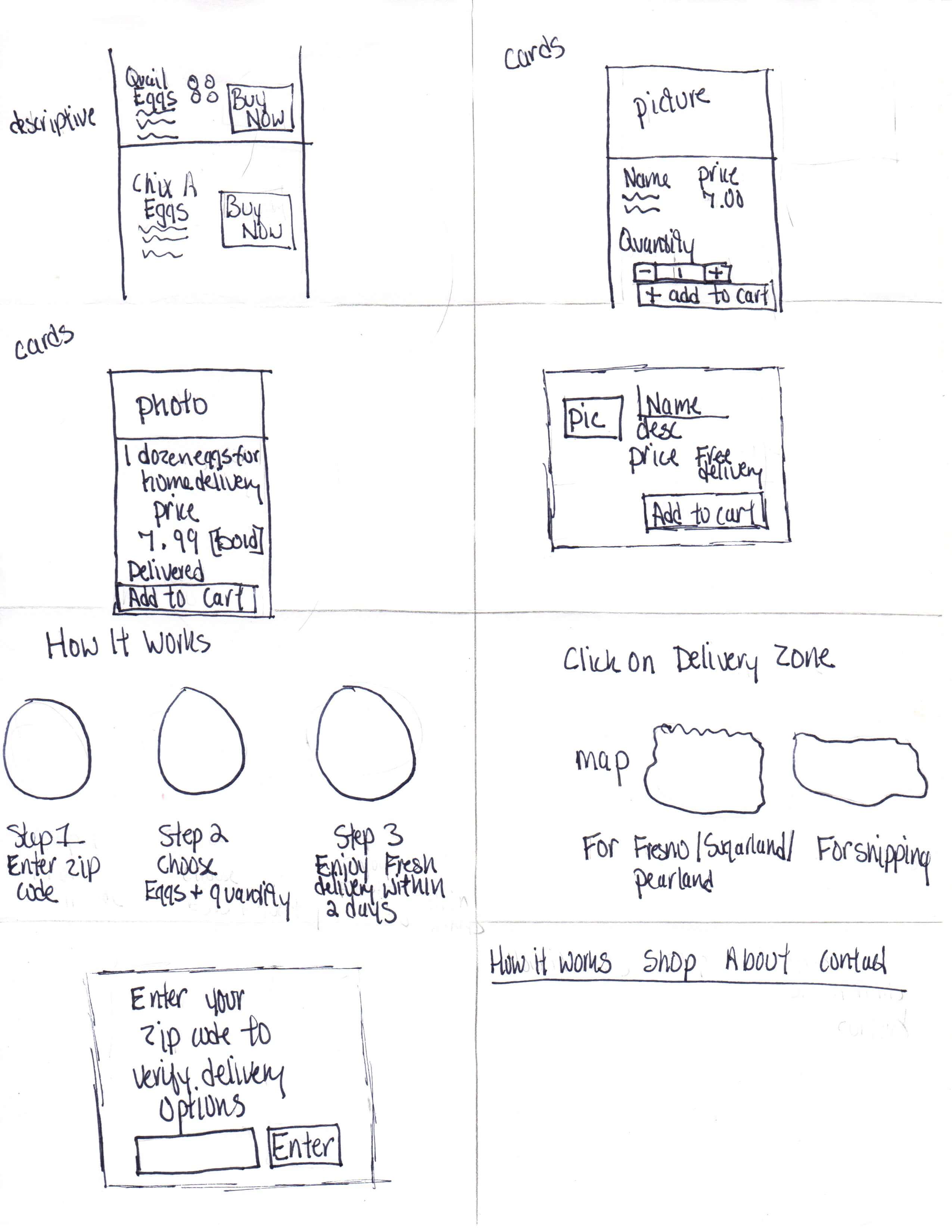
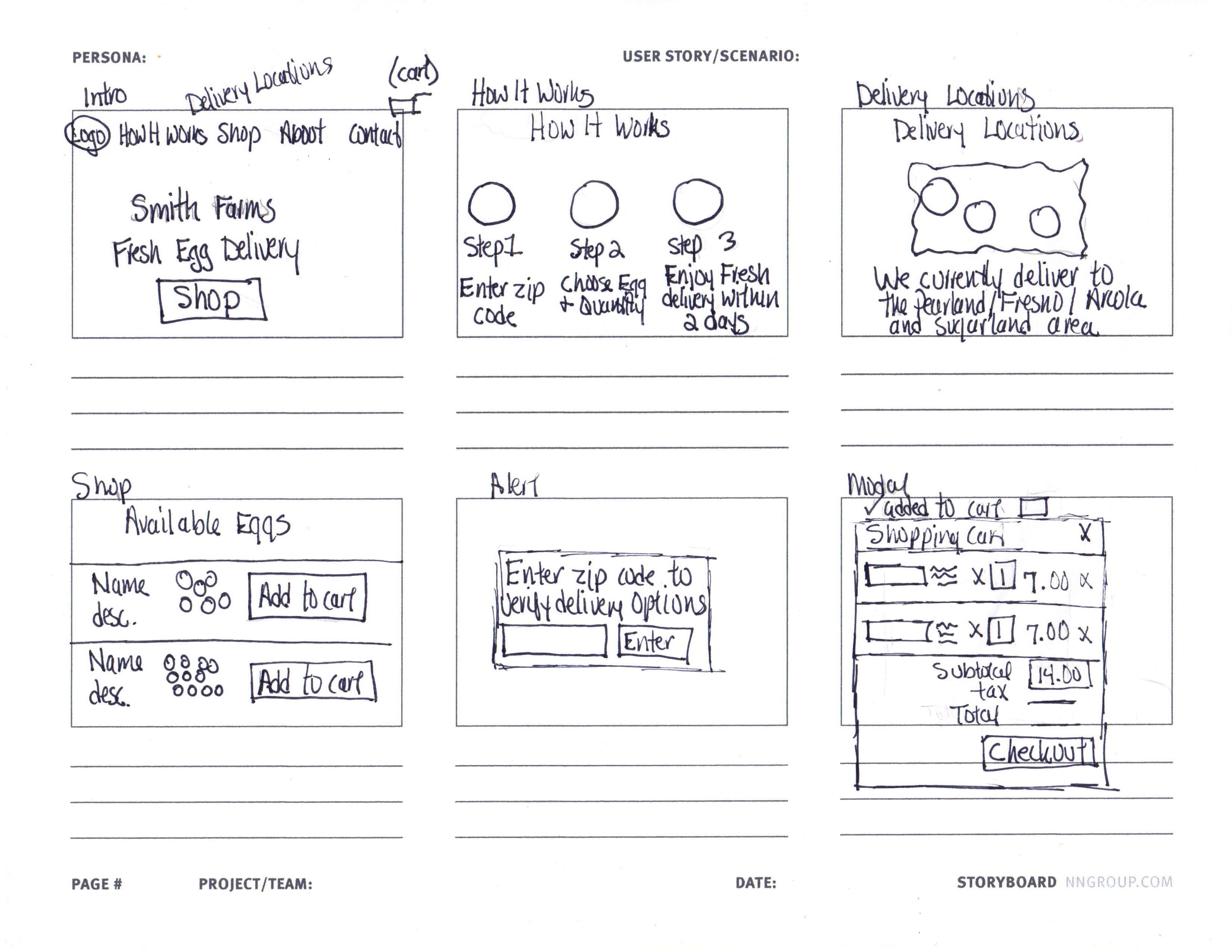
Explore product-page and delivery-verification approaches before choosing a direction.
Prototype
Build the primary purchase flow and supporting informational pages in Figma.
Test
Test the purchase experience remotely with existing customers and personal contacts.
Design around the realities of a small local business
The owner did not need a complex retail platform. The experience had to support a small product catalog, local delivery limits, and customers with a wide range of technical comfort.
Existing trust was already strong
Customers already knew and valued the products. The main challenge was giving them a convenient new way to order.
Delivery eligibility mattered
The site needed to prevent out-of-range orders while avoiding a frustrating dead end after customers had already built a cart.
The system had to stay simple
The owner needed a low-maintenance experience that would not require ongoing technical management.
Journey decision
I kept the catalog browsable and placed zip-code verification at the point of adding an item to the cart. Customers could see what was available before being asked to confirm delivery eligibility.
Explore where delivery verification should enter the purchase flow
The product page was the most important screen because the catalog was intentionally small. I explored how customers could understand the products first while still being protected from beginning a checkout they could not complete.
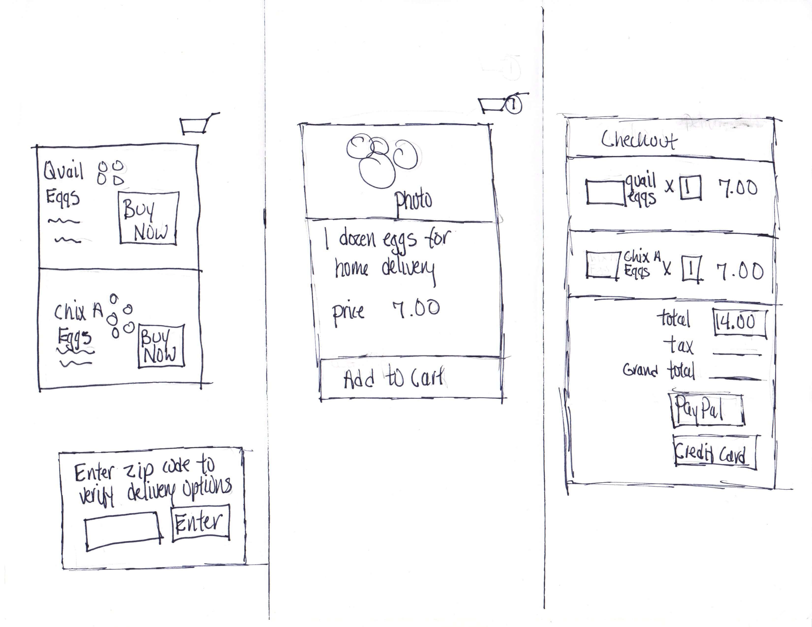
Selected direction
The cart-triggered zip check preserved product discovery while still preventing ineligible customers from moving too far into checkout. Delivery areas were also stated directly beneath the zip field so the constraint was transparent.
Define the verified-customer purchase path
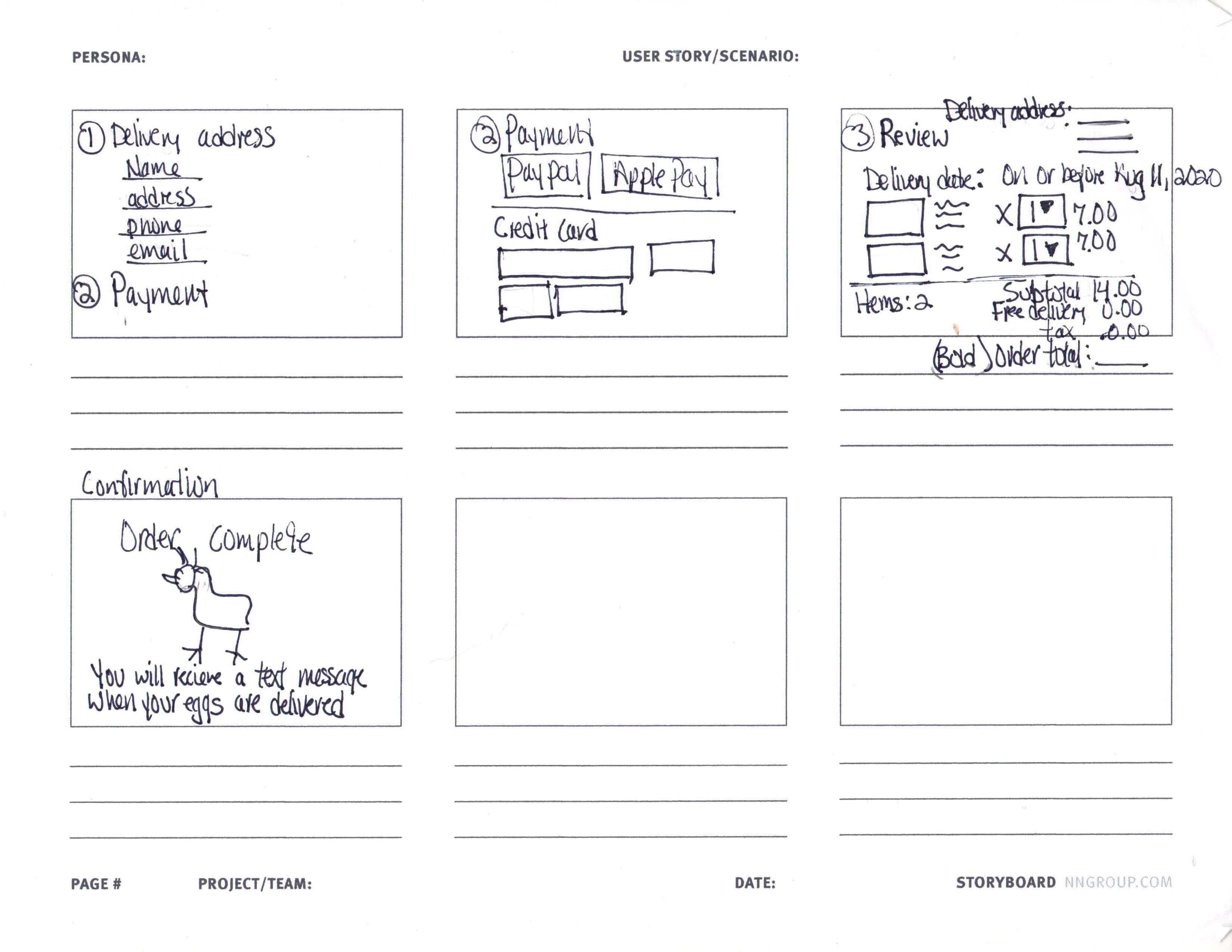
The owner and I aligned on prototyping the path a local customer would take after confirming that delivery was available in their area.
Create a purchase flow that feels familiar and trustworthy
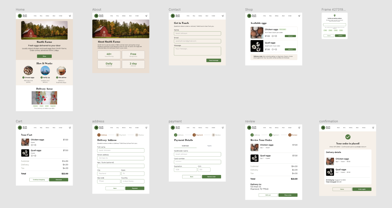
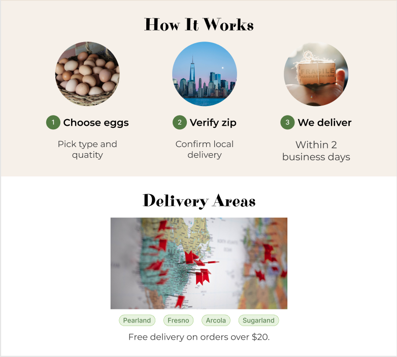
I built the primary desktop purchase flow in Figma along with informational pages such as How It Works, Delivery Locations, About, and Contact. The color palette drew from the farm's existing egg-carton packaging to create continuity for customers who already knew the product.
Explore the prototype
Follow the local purchase flow from browsing products through checkout and confirmation.
Validate the purchase flow with real and representative customers
The prototype was tested remotely with five participants, including existing Smith Farms customers and personal contacts. The goal was to confirm that the purchase flow could be completed without instruction and that zip verification did not create confusion or drop-off.
What worked
The end-to-end purchase flow was straightforward, and participants responded well to the simple information hierarchy and the three-step How It Works explanation.
What testing added
Participants wanted the experience to better support the ongoing relationship they already had with the farm, particularly around pickup, saved information, and repeat-customer benefits.
Design for repeat customers, not just a first purchase.
Pickup option: Several participants preferred placing an order online and collecting it directly from the farm. A pickup flow was scoped as a future iteration while delivery remained the launch model.
Saved account information: Repeat customers expected to save their address and payment details instead of entering them again on every order.
Loyalty: Interest in rewards reinforced that customers viewed the relationship as ongoing rather than transactional.
Constraints helped create a more focused experience.
This project reinforced that a small catalog, limited delivery area, and simple operating model did not need to be treated as weaknesses. Designing directly around those constraints kept each screen focused and made the purchasing experience easier to understand.
The most valuable testing insight was the request for saved customer information. I had initially associated simplicity with avoiding account creation, but repeat customers saw saved details as convenience, not added complexity. For a business built on familiarity and trust, the online experience should support that same sense of an ongoing relationship.