SavR Recipe App Redesign
Redesigning the active cooking flow to make recipes easier to follow, reduce uncertainty, and give home cooks clearer step-by-step guidance when they need it most.
View Prototype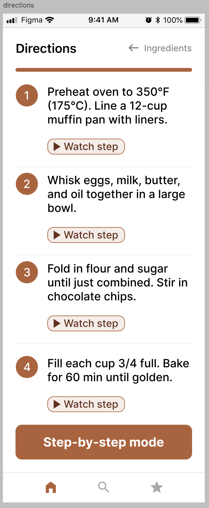
Make the cooking experience easier to follow once the recipe begins.
Problem
Home cooks who want to try new recipes often struggle to find, follow, and revisit meals in one cohesive experience. Existing recipe apps can be cluttered, require too many taps, and offer limited support once active cooking begins.
Design direction
I redesigned the SavR cooking flow around clearer recipe structure, visual guidance, and an optional step-by-step mode so users could move from discovery to preparation and cooking with less uncertainty.
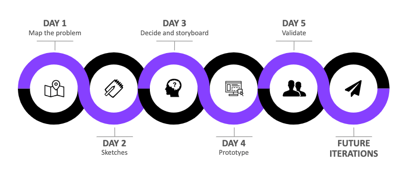
Map
Understand the cooking journey, user pain points, and where uncertainty appears.
Sketch
Review recipe-app patterns, run Crazy 8s, and explore a critical directions screen.
Decide
Prioritize step-by-step video guidance and storyboard the core cooking flow.
Prototype
Build a realistic prototype with enough screens to simulate making a recipe.
Validate
Test with five home cooks and use the findings to refine the experience.
A quick look at the redesigned SavR experience
Find where cooks lose confidence during a recipe
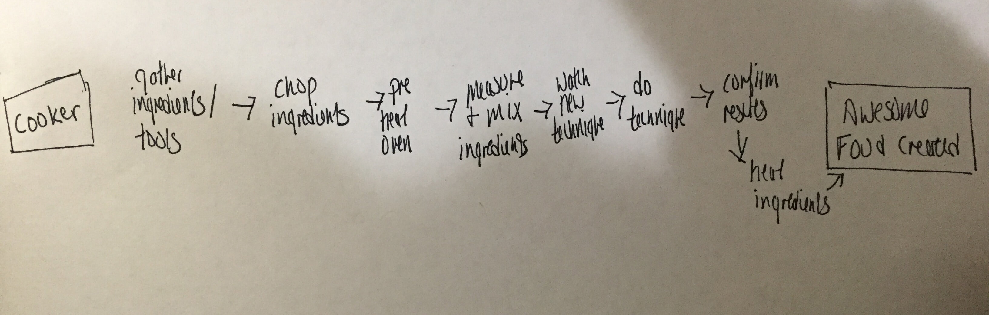
Users wanted to learn new dishes and techniques, but they could not always tell whether they were doing a step correctly. More complex recipes created uncertainty around technique, timing, and what the food should look like at each stage.
Need visual confirmation
Users wanted a clearer way to compare their progress with what the recipe should look like during preparation.
Time matters
Home cooks wanted to manage time efficiently and avoid repeatedly stopping to search for the next instruction.
Too much phone interaction
Users preferred not to keep returning to their phone for every step while their hands and attention were occupied.
Day 1 takeaway
The main opportunity was not simply organizing recipe content. It was supporting confidence and momentum while the user was actively cooking.
Explore a clearer directions experience
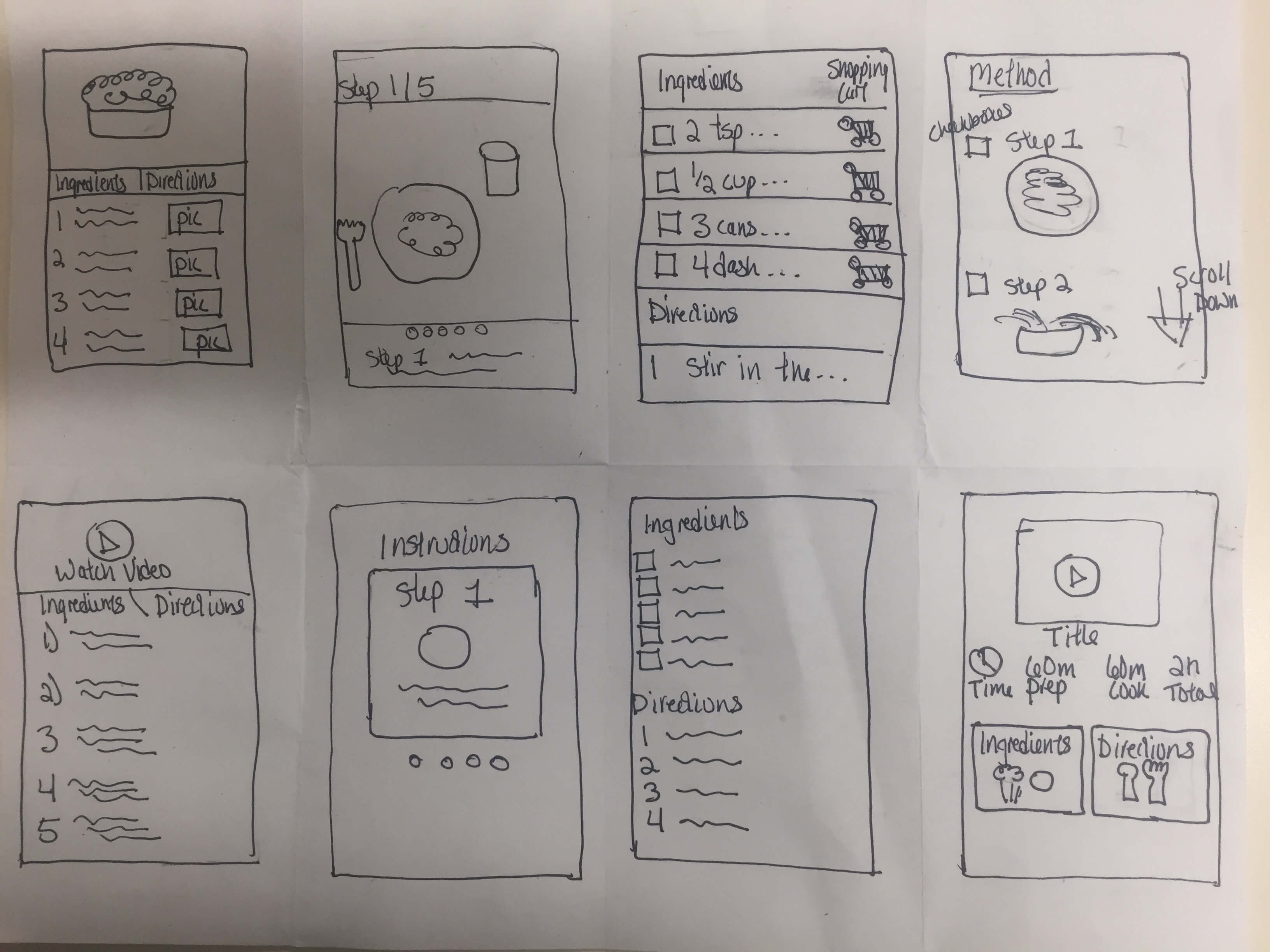
I reviewed common recipe-app patterns such as shopping lists, technique videos, separated ingredients and directions, and step-by-step instructions. I then used Crazy 8s to rapidly explore alternatives for the most critical screen.
Critical screen
The recipe directions screen became the focus because this was where users reported the most difficulty. The experience needed to be simple to scan while also offering deeper visual help when a technique was unfamiliar.
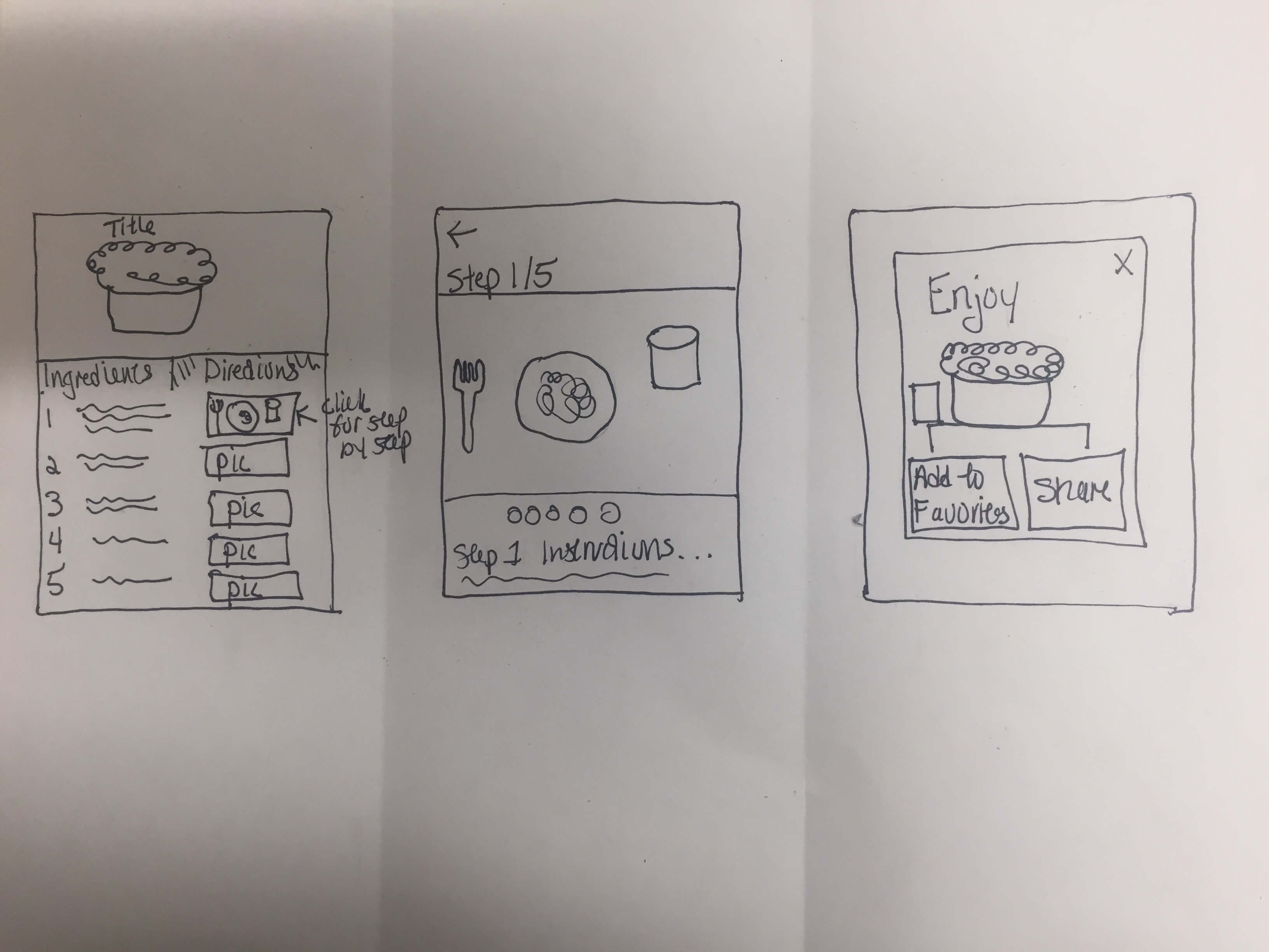
Prioritize step-by-step video guidance
Interviews suggested that users were not only forgetting ingredients or steps. They were getting stuck when they did not know how to perform a cooking technique. That made visual, step-by-step support more valuable than relying on a text list alone.
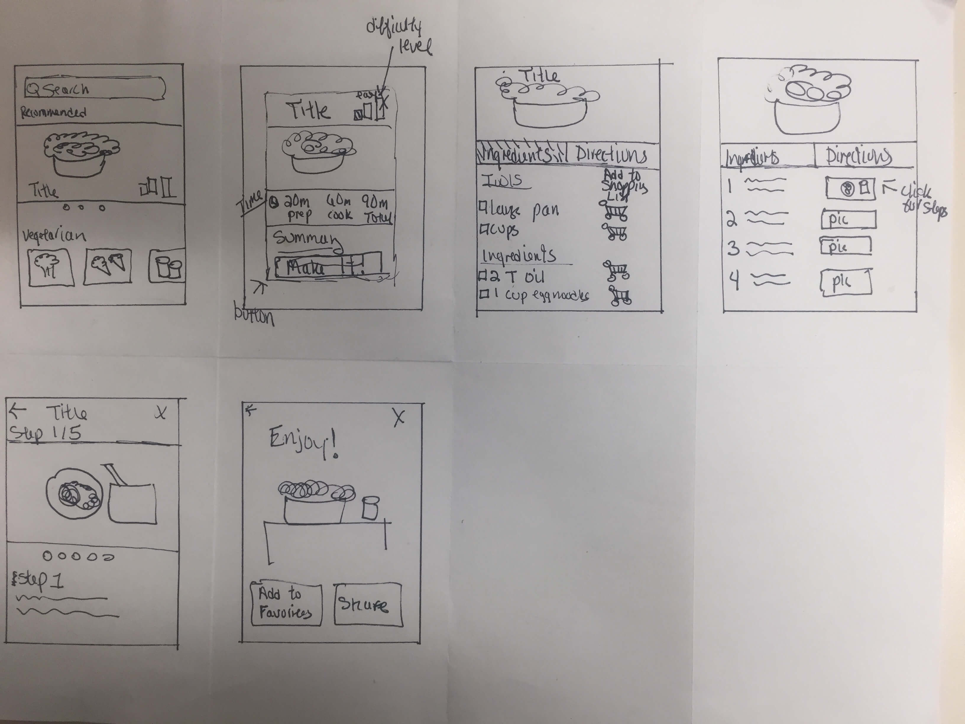
Build enough of the experience to simulate cooking a recipe
I created a prototype based on the selected flow and added enough step-by-step screens to make the cooking experience feel realistic during testing. The interface used a warm peach palette to support an appetizing feel without the intensity of a stronger red.
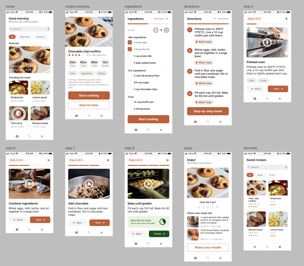
Try the prototype
Explore the recipe flow from discovery through the step-by-step cooking experience.
Test the core cooking flow with five participants
I conducted moderated, in-person usability testing with five friends and family members who cooked at least once a week, regularly followed new recipes, and were comfortable using smartphones.
What worked
Participants liked the simple structure, category browsing, and warm visual design. Several compared it favorably with recipe apps that felt cluttered or ad-heavy.
What needed refinement
The biggest usability issue was discovering how to enter step-by-step mode. Participants also wanted more social proof from other people who had made the recipe.
Step-by-step mode was difficult to discover
Before: Small direction thumbnails implied access to step-by-step guidance, but participants often read them as decorative images.
After: I replaced the implied interaction with explicit “Watch step” actions and a dedicated “Step-by-step mode” button.
Build confidence with social proof
Before: The Enjoy screen functioned mainly as a completion state.
After: Community notes and photos from other cooks were added to make the end of the flow more useful and reassuring.
Reduce mid-cook navigation
Before: Ingredients and directions required more tab switching while cooking.
After: Serving-size controls stay with ingredients while the directions experience remains more self-contained.
Small interaction cues can determine whether a useful feature gets used at all.
The most important lesson from testing was that a feature can make sense in the designer's head and still remain invisible to users. Replacing an implied interaction with an explicit “Watch step” action made the step-by-step experience far easier to discover. Testing also surfaced the value of community photos and notes, which turned the end of the cooking flow into a more useful confidence-building moment.
If I continued the project, I would explore a serving-size scaler that dynamically adjusts ingredient quantities and a more personalized home screen based on what a user saves and cooks over time.